[ad_1]
By Andrew Osmond.
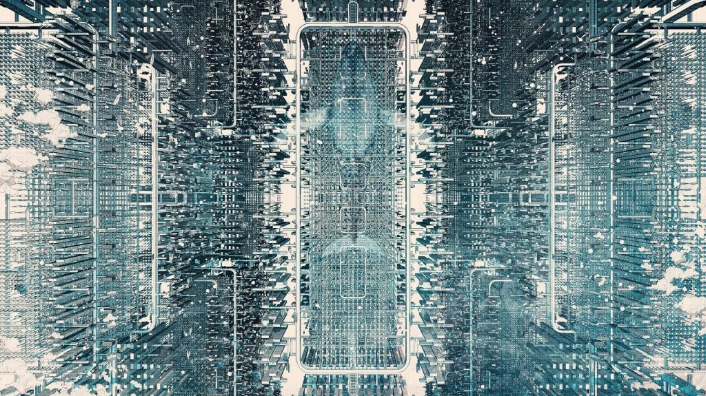
In 2019, the architect Eric Wong was invited to make a world; the cyber-world of U in Mamoru Hosoda’s Belle. For Wong, that led to months considering twilight skies, linear spaces, and how to arrange sound speakers on the back of a flying whale. He discussed these questions with Hosoda online, but never met him in the flesh until Belle’s British premiere at the London Film Festival. At that screening, Hosoda pointed out Wong in the audience and invited thunderous applause.
Wong reveals he hadn’t seen Belle all through until the London screening. “I felt, oh wow, it’s really come to life. I didn’t want to see it beforehand, I wanted to see it at a very special moment. I also had a chance to go to dinner with Hosoda.” He holds up what the director gave him – a original sketch of Belle.
Before Belle, the London-based Wong studied Art and Architecture at the Byam Shaw School of Art (now merged with Central Saint Martins). He graduated with a Masters from the Bartlett School of Architecture; Bartlett also awarded him a medal for outstanding academic achievements in professional performance. Wong completed his studies as an architect at Cambridge.
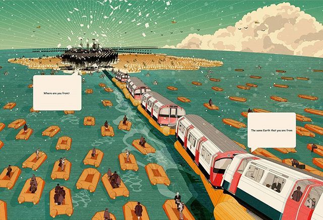
U wasn’t Wong’s first speculative world. In 2016, he created Cohesion: The blueprint for a United Kingdom. This project imagined a UK with a new capital in the Isle of Man. In Wong’s words, the project drew on “famous British creatives who depicted a sort of romanticised and alternative urban utopia,” such as Heath Robinson.
Wong’s work on U began in October 2019, when he was one of multiple concept artists pitching to work on Belle. Wong wasn’t presented with a script, but with a tantalising series of ideas. “I got a series of texts, very short sentences talking about a castle, a virtual world, and a place called U.” A sample phrase: “Within the walls of the garden, Belle’s enchanted castle.” Wong is sure, “They didn’t want to give away the storyline to anyone at the time.”
At this point, Wong wasn’t communicating with Hosoda himself, but with the CG studio Digital Frontier, which handled Belle’s CGI. Digital Frontier had worked with Hosoda’s Studio Chizu on Wolf Children and on all of Hosoda’s films since.
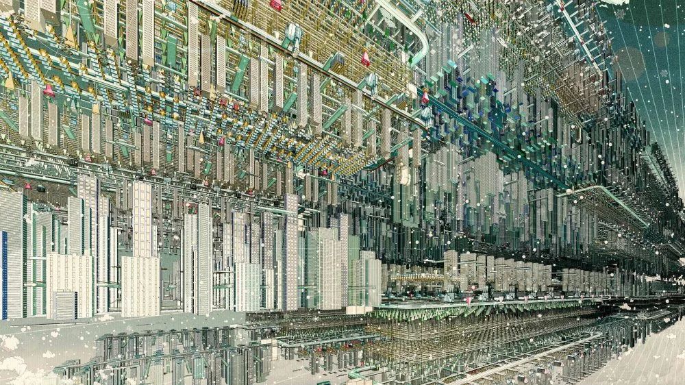
In this first phase, Wong investigated a variety of castles (“a small, more intimate castle, or a cuter version”), as well as U’s fundamentals: its horizon, its equator. In the final film, the two notions are linked intimately. U’s equator is its horizon, a red line literally circling the world, supplemented by another line smoothly oscillating through it and a crescent moon.
You’ll see the equator during Belle’s very first song performance, where it’s visible behind the buildings under and over it. It stresses the idea that U is a linear world; for all its many structures, U offers clean lines of sight. “There was this idea of no heaven or earth, no left or right, an omnidirectional stage,” Wong says.
What Wong didn’t know at first was how many concept artists he was pitching against to work on Belle. Eventually, he says, he found out he had fifty rivals. “Hosoda decided to choose me, and that’s when I got in contact with him. He said that he enjoyed my initial design.”
From then on, Wong and Hosoda would speak online every week. Due to the time difference between Britain and Japan, the meetings would be at seven in the morning: “I didn’t want to be too late for Hosoda,” Wong says.

Throughout the period when Wong was working on U for Belle, he was also holding down a full-time day job as an architect, working at an architectural practice or teaching at university. In theory it was a nine to six job, “but you never really finish at six in architecture, so I’d finish at seven or eight.” Commuting to and from work, Wong would create hand-drawn sketches of U. His main work for Belle was at night, in four-hour sessions visualising cyberspace from ten till two in the morning. Given his morning talks with Hosoda, Wong often got just three and a half hours of sleep at night.
Wong’s finished pieces were computer models, environments that could be examined from all perspectives or walked through. “However, I didn’t want the computer to dictate the vision of the story. I tried to stay as true to the hand-drawn sketches as possible.” Wong redrew on top of models, or used composition and collage to get the desired image. When Hosoda gave feedback, the director created hand-drawn sketches to show Wong what he wanted, drawing out the design ideas he liked most.
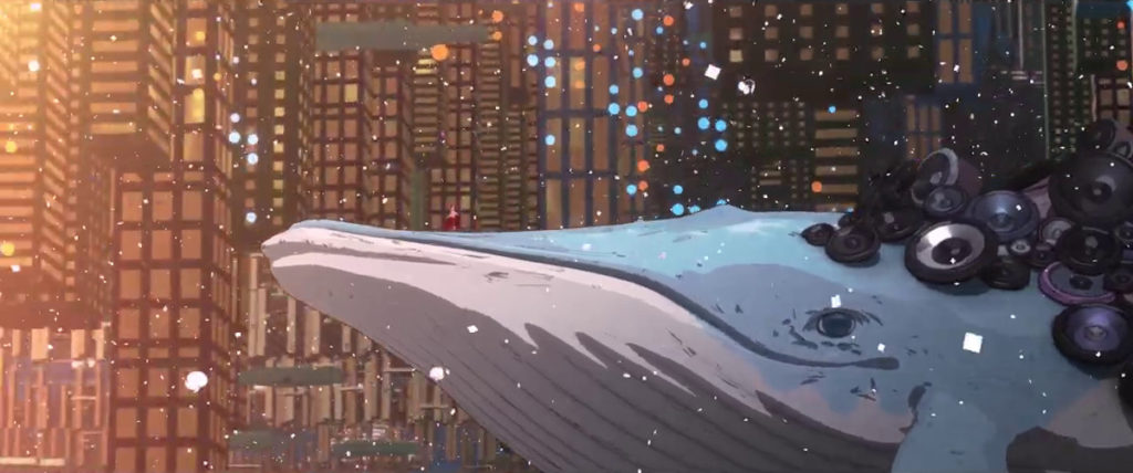
And there were a great many design ideas. Animation fans know the medium involves enough concept work to fill galleries, but U especially involved a dizzying number of permutations and alternative ideas. In his early communication, Hosoda highlighted the idea that Belle should be a “progression” of his 2009 cyberspace film Summer Wars. An obvious link between the films is the whales – Wong was briefed about how they should glide through the city, and started sketching whales with speakers, prominent in the final film.
Other links between Summer Wars and Belle were considered. One version of U would have featured a totem pole with features from two Summer Wars characters – the ears of the fighting rabbit King Kazma, and the wings of the heroine Natsuki. However, Hosoda also wanted U to contrast with OZ, the world in Summer Wars. While OZ was built on opaque white backgrounds, Hosoda wanted U predominantly based around night scenes.
This was an issue that would exercise Wong throughout his time on Belle. “What does a twilight sky mean? Is it warm and calm? Cool and cloudy? Changing and unfamiliar? Do these night skies change throughout the ‘day’? How do we denote this?” Wong appreciated the irony of creating this world at the dead of night. “I guess it’s quite fitting for a twilight sky in a city!”

For reference, Wong went through pictures of “bright” nights, glowing horizons and neon nights, such as those in the Blade Runner films. Anime has also dealt with cities at night – the classic is Akira. “I didn’t use it as a reference directly,” Wong said, “but it was probably subconscious. I grew up watching a lot of anime and I loved Akira and a lot of other anime films.” U’s aesthetic, though, was less Neo-Tokyo than New York. Wong talks of “the notion of a Manhattan solstice, this twilight sky that constantly glows.”
In the midst of this process, Hosoda dropped a bombshell. “Hosoda said that actually he wasn’t sure about (Belle’s) design. He said, ‘I know we pushed in the direction of Summer Wars, but I’d like to break the Summer Wars feel, and I enjoyed your initial concept art a lot more. So, I want you to do what you do best and revisit and combine everything you’ve learned, continue on and I’ll see you in three or four days.’
“Three or four days?” Wong laughs. “On top of a fulltime job? Okay, I’ll see you!”
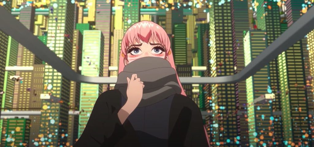
At the time, the film’s working title wasn’t Belle but Love Song, which gave Wong ideas. He remembers thinking, “Okay, let’s borrow the notion of a harp, because a harp encapsulates love and music, much like Cupid holding the harp in early paintings. So, as we zoom into the harp, a string ultimately became the city.” While the harp motif dropped out, the image of a single string “opening” into U’s landscape would become Belle’s very first image.
Hosoda was delighted with it, and with the related imagery of a straight, linear city. “He said it reminded him of the opening of The Girl Who Leapt Through Time, and he was so surprised by that.” That film also starts with a line across the screen, which resolves into a digital timecode. “I’ve watched the film but it wasn’t an apparent decision, more a subconscious one – oh yeah, I guess it does!”
The image of the line also resonated with other parts of Belle. “Hosoda says the single line reminds him of the river that Suzu passes all the time, which reminds her of her mother in the real world. So, there was some poetic relevance to a previous film, to the current film, and the simplicity of the single line that actually contains this vast world called U.”
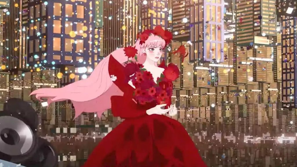
As well as simple lines, Wong was also concerned with the minutiae of commercial design. He had to work out the apps on Suzu’s phone, including the U app itself, which led into questions of how thick or thin the letters should be and umpteen other questions of designing lettering and logos. Logos are also linked with one particular U character, who wields them like a superpower. Wong had to decide which logo colours would suit an online environment in 2021; he favoured “Pokémon Blue and Pokémon Yellow because they’re infamous colours in adverts, and Spotify green.”
Other challenges included designing the huge dome where the Beast first appears while Belle is holding a concert, Hosoda wanted it to be a structure made up of puzzle pieces, which could open and close. That’s indeed how it appears in the film, banded by its own red-line equator. Wong also spent time on U’s park space, which you might not even notice when you watch the film. The geometric cyber-foliage is visible at the top and bottom of U’s bustling centre. Again, the park went through numerous shapes and colours as Wong considered whether, for instance, U should have topiary.
Given Wong previously created the playfully utopian Cohesion, does his version of U reflect particular values and ambitions? “It’s very hard to pin down in a few words,” Wong says, though he describes it as a city fit for all, a universal space where everyone can enter freely. “I think you see a series of thoughts and references borrowed from speculative visions of architecture – ideas of compact living, cohesive living, and all these interesting notions. I think they’re subconsciously dropped in.”
“Despite the world of U being virtual,” Wong concludes, “there are still lessons and underlying visions that can be expressed in the real world.”
Andrew Osmond is the author of 100 Animated Feature Films. Mamoru Hosoda’s Belle, featuring Eric Wong’s architectural designs, is released in the UK by Anime Limited.
[ad_2]
